A History of California Restroom Signs
California requires at least two signs to identify each restroom open to the public. Although this duplication seems
unnecessary, there is a story to the rules that features the usual role players of government regulation good intentions, grand ideas,
and enough bureaucratic inertia to keep everything confusing and almost silly. The story starts some years prior to the passage of the
ADA, when a man named Sam Genensky (partially blind himself) set out to make restrooms easily identifiable to those with limited vision.
His idea was to use large geometric shapes with edges thick enough to be felt by those with no usable vision, and to be easily seen,
even from a distance, by those with limited vision and people with cognitive disabilities.
A twelve inch diameter circle identified a girls' or women's restroom, and a twelve inch equilateral triangle identified
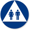
a boys' or men's restroom. A triangle placed on a circle was used to identify a single user restroom available to either sex. An important
consideration was that the color of the shapes had to contrast with the door on which they were placed.
No pictograms or text were required but many designers thought the signs looked "empty" and added pictograms for men or
women, sometimes with text as well. With the passage of accessibility standards, Braille was sometimes added. This simple and clear system
of symbols was a successful first stab at making restrooms accessible to everyone. Many people who were legally blind were trained to
recognize these symbols, and spared the embarrassment of walking into the "wrong" restroom.
Eventually, early adopters of accessibility like California were followed by other states and later on the Federal Government.
In 1990, the ADA came along, mandating federal standards for restrooms to be identifiable by touch. Of course, the federal agency charged
with developing the rules didn't consider using California's well-established door symbol. They wanted a raised character sign with Braille
to be located adjacent to the door, not on the door. Their concern was that if someone was reading the sign up close and the door suddenly
opened, that person could get hit in the face and seriously injured. The California signs didn't usually have that problem, since it took
only a quick touch of the fingers to tell if the sign edge was curved (women) or straight (men). No actual reading was necessary. However,
the "feds" insisted on the wall sign, and didn't allow California's door sign as a substitute. The new regulations had some other requirements
as well. When the restroom was accessible, it was required to display the International Symbol of Accessibility (ISA), or "wheelchair
pictogram." If it was not accessible, a sign had to be mounted nearby directing to the nearest accessible restroom. That sign also had to
display the ISA.
The code body in California briefly considered eliminating the requirement for the geometric signs. After all, the wall sign
now required by the federal guidelines offered the same information in both visual and tactile format. Why have two signs? The disability
community responded with anger. They wanted their circles and triangles! They were used to them, they were unique to California, and they
spoke of California's proud history of pioneer effort in the field of disabled access. The signs stayed, and that's how California came
to require multiple signs for each restroom.
California Rules
Now that we know how the two-sign requirement came into existence, we can look at what exactly the regulations require
in California for the identification of public restrooms and other sanitary facilities such as shower rooms, bathrooms, and locker rooms with
lavatories or restrooms inside:
Tactile Wall Sign
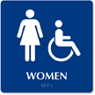
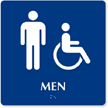
As per the ADA, each restroom must be identified with a tactile wall sign. The usual text is Girls or Women, Boys or Men, or
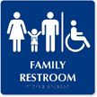
Restroom (for a unisex facility). Restrooms intended for families, or for disabled persons accompanied by attendants are often called "Family
Restroom." Other appropriate legends might be "Women's Locker," "Shower," or "Bathroom." The text might be accompanied by an appropriate pictogram.
If it is, the pictogram is placed in a six inch high field located immediately above the tactile text. Contracted (Grade 2)
Braille with California spacing is placed between 3/8 inch and 1/2 inch immediately below the tactile text. Text and Braille must be in a
horizontal format, and Braille dots must have a domed or rounded shape. If the restroom is accessible, the International Symbol of
Accessibility (ISA), or "wheelchair pictogram" may be included on the wall sign adjacent to the gender pictogram, or it may be on a
separate sign, or on the geometric door sign.
Geometric Symbol Sign
A geometric symbol sign is centered on the door, with the vertical center of the sign 60 inches above the finish floor.
The entire symbol must contrast with the door. Your sign must be light on a dark door, or dark on a light door. The symbol for a facility
to be used by females is a 12 inch diameter circle, 1/4 inch thick. For a male facility, the symbol is a 12 inch equilateral triangle,
1/4 inch thick. For a single user or "family" facility (unisex), a 1/4 inch triangle is superimposed on a 1/4 inch thick circle 12 inches
in diameter. Although it isn't stated in the code yet, the triangle should contrast with the circle, which should contrast, in turn, with
the door. It is fine to include the International Symbol of Accessibility on the geometric symbol, or even to repeat the appropriate gender
pictogram. However, if you do choose to put the gender pictogram on the geometric symbol, you must also include it on the accompanying
tactile wall sign. The ISA does not need to be repeated on the wall sign. If text, a pictogram or ISA is included on the geometric symbol
sign, it must contrast with the sign background, and the sign and graphics must be non-glare.
Directional Sign

If the restroom being identified is not accessible,
the only change in the sign is that it does not include the International Symbol of Accessibility. You should place an informational or
directional sign in the proximity of the restroom to direct persons with disabilities to the nearest accessible restroom. This sign must
include the ISA, and the appropriate text and arrow. It does not need to have tactile characters or Braille. The sign must have high
dark/light contrast, non-glare surfaces, and use text that is non-decorative and appropriately sized.
Questions and Answers
Q. Does the door sign or wall sign, or both, have to be blue?
A. No. The door sign must contrast with the door. The wall sign can be any color, as long as the text and other graphics
on the sign contrast with the sign. In California, the International Symbol of Accessibility is sometimes required to be white on a federal
blue background. In terms of interior signage, this requirement is waived for aesthetic purposes, or to provide contrast with the door.
Q. Is it enough contrast if my door sign has a border of a contrasting color around the symbol?
A. No. A border does not provide sufficient contrast. The entire symbol should contrast with the door.
Q. If I put a male or female pictogram on the geometric door sign, why would I need to repeat it on the wall sign?
A. The federal guideline doesn't really acknowledge the state sign, and it requires the pictogram to always be placed
above corresponding tactile text and Braille. Since you can't put tactile information on the door, except in rare circumstances, you
need to put the pictogram on the wall sign. If you want to repeat it on the geometric sign, that's OK.
Q. Why not just add the ISA to the wall sign. Why do you suggest putting it on the door sign?
A. The code and guidelines don't tell us where to put the ISA. You could even put it on a third sign! We prefer it on the
door sign because there's a nice large space available on that sign. It sometimes is rather crowded on the wall sign. We like to use each
symbol and pictogram just once per restroom to reduce sign clutter.
Q. I thought the pictogram had to be six inches high. What does a "six inch high field" mean?
A. Since pictograms have all different shapes, some tall, some wide, the federal agency writing the guidelines decided to
regulate the height of the space within which to put the pictogram (the figure) rather than trying to regulate the height of the pictogram
itself. Theoretically, you could put a one inch high pictogram in the six inch high space, but hopefully, most people will fill up the
majority of the space with the pictogram.
Q. What kind of text do I put below the wheelchair symbol? Shouldn't it be tactile, with Braille?
A. The International Symbol of Accessibility needs no text. It is visual, and informs people with mobility impairments
that the restroom is accessible by them.
Q. Are the pictograms and symbols on the sign required to be tactile?
A. No, although it's OK if they are tactile. However, very few people who read by touch recognize any of the common
pictograms and symbols. That's why it's important that pictograms are accompanied by tactile text and Braille when they identify rooms.
Just the pictogram alone wouldn't be enough for a person who is completely blind, even if it were tactile.
Q. What do I do if there isn't any door on the restroom. What if there is just an opening?
A. In that case, you could put all the tactile information on the geometric symbol, and mount that symbol adjacent to
the doorway or opening. Mount the symbol centered vertically at 60 inches from the finish floor.
Q. What if my building is old and there is no room for a wall sign at all?
A. If the restroom door opens inward, away from the sign reader, you could put the tactile information on the geometric
symbol sign, and mount it on the door. That is called "equivalent facilitation." You have provided the best solution possible, and no one
will get hit if the door is opened suddenly from the inside. If your door opens out, don't use a tactile sign. Just use the geometric sign,
with visual (non-tactile) graphics on the sign or above the door if you wish. You don't want someone to get injured while trying to read a
tactile sign.
Q. What if I prefer to use a term like "Ladies" or "Gents," or even "Cowboys" and "Cowgirls" for my restrooms?
A. The code doesn't say you can't, but you might consider putting these kinds of "theme" words on the door sign, or even
paint them above the door, and putting the more universal text on the wall sign next to the door. You want as many people as possible to
understand your signs.
Q. What about terms like "Women's Restroom" and what about just putting "Staff" on the staff restrooms?
A. Think about someone who is blind trying to find the appropriate restroom. If the text says "Women's Restroom," they
are apt to read the word "Restroom" and not even notice the word "Women's." A man might go into the women's restroom, thinking it was a
unisex facility. You don't want to use a term like "Staff" by itself, because the facility could be anything from a workroom to a break
room. The best solution for accessibility is to use the shortest and most consistent text possible, coupled with the most understandable
terms. Using the pictogram above the text, even if it's not required, will help persons with low vision and those with cognitive
disabilities or limited English.
LET'S RECAP
Remember - You can always get a full "
California Compliance Kit" from MyDoorSign.com. This way, you will save time and money - read below to remind yourself exactly what you need to order.
Accessible Restrooms and other Sanitary Facilities
Option 1
Use a code compliant wall sign with tactile characters accompanied by California Braille. We recommend including a gender
pictogram in the space above the text. On the door, include the appropriate and code compliant geometric symbol sign, and include the
International Symbol of Accessibility on the sign.
Option 2
Use a code compliant wall sign with tactile characters accompanied by California Braille. Above the text, include a side by
side gender pictogram and the ISA. On the door, include the appropriate and code compliant geometric symbol sign. The sign can be blank,
or it can include the repeated gender pictogram.
Option 3
Use a code compliant wall sign with tactile characters accompanied by California Braille. On the door, include the
appropriate and code compliant geometric symbol sign, and include the International Symbol of Accessibility on the sign.
Inaccessible Restrooms and other Sanitary Facilities
Option 1
Use a code compliant wall sign with tactile characters accompanied by California Braille. We recommend including a
gender pictogram in the space above the text. On the door, include the appropriate and code compliant geometric symbol sign. The sign can
be blank, or it can include the repeated gender pictogram. An informational or directional sign must be mounted in the proximity of the
restroom. The sign must comply with rules for visual signs, must include the ISA, and must direct to or inform about the nearest
accessible restroom.
Option 2
Use a code compliant wall sign with tactile characters accompanied by California Braille. On the door, include the
appropriate and code compliant geometric symbol sign, blank. An informational or directional sign must be mounted in the proximity of the
restroom. The sign must comply with rules for visual signs, must include the ISA, and must direct to or inform about the nearest accessible
restroom.
Always consult the law when you are uncertain about what to do in a particular facility, or if you think that unusual
circumstances at your restrooms may require a creative solution. You can learn about the law from the U.S. Department of Justice ADA home
page. Remember, the codes are written in order to make our facilities as accessible as possible, and a little bit of effort in understanding
the requirements can have a great impact on the usability of your facilities. Californias accessibility standards may be confusing, but as
with other stories of great ideas and good intentions, the confusion is the result of years of hard work at simplicity. Good enough for
government work, as they say.
— Sharon Toji










 If the restroom being identified is not accessible,
the only change in the sign is that it does not include the International Symbol of Accessibility. You should place an informational or
directional sign in the proximity of the restroom to direct persons with disabilities to the nearest accessible restroom. This sign must
include the ISA, and the appropriate text and arrow. It does not need to have tactile characters or Braille. The sign must have high
dark/light contrast, non-glare surfaces, and use text that is non-decorative and appropriately sized.