A.
In reviewing the federal accessibility and signage codes, it is always important to remember the actual intent of the law. The purpose of an Exit sign is simple: to help you find your way out in an emergency. There are really two kinds of Exit signs, Directional and Doorway.
• Doorway exit signs are posted at actual exits, or stairs or ramps that lead to exits.
• Directional exit signs are posted in hallways or large spaces, and give directions to the nearest exit.
Illuminated or photoluminescent Exit signs which lead to an exit, but not those in a hallway or other directional Exit signs, should be accompanied by a tactile Exit sign. Associate evacuation passageways, stairs, and exit doors with both tactile and visual exit signage. Illuminated or photoluminescent signs marking exit doors should be accompanied by a tactile sign. In hallways or large spaces, other illuminated or photo-luminescent signs that just point to the way out do not need a tactile sign. In a hallway, in fact, a tactile sign may actually confuse a visually impaired person, and leave them thinking that a closet or other interior door along the hallway is an exit.
(1) So, here is the answer to the first question: tactile Exit signs are generally not used for Bathroom doors. In a bathroom, usually the way you came in is the way you will go out. There is not really any reason to put a tactile Exit sign in the restroom – it will only lead to confusion.
(2) Then, let's move onto the question about Doorway exit signs and have a chance to debunk a common bias here: if people who can see well deserve some help finding the correct door ... why not provide the visually impaired the same benefit? Thus, for doorway exit signs, we recommend tactile signage.


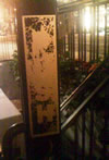
 Thanks for the photo! These other signs have four main problems.