- Home
-
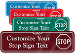
Custom
-
- Custom Safety & Informational Signs
- Custom Directional & Wayfinding Signs
-
-
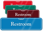
Restroom
-
- Signs by Type
- Related Signs
-
-
ADA-Braille
-
- Directional & Informational Signs
- Braille Room Signs
-
-
Room
-
- Computer Room
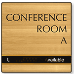
- Conference Room Signs
- Dressing Room Signs
- Electrical Room Signs
- Exam Room Signs
- Fitness Room Signs
- Hall Passes
- Laundry Room Signs
- Locker Room Signs
- Lunch Room Signs
- Mechanical Room Signs
- Medical Wayfinding Signs
- Meeting Room Signs
- Private Room Signs
- Room Key Tags
- Room Number Signs
- Storage Room
- Utility Room Signs
- Waiting Room Signs
-
- Sliding
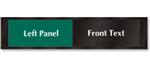
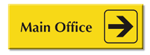
- Office
-
Entrance & Exit
-
- Exit Door Signs
- Bilingual Exit Signs
- Braille Exit Signs
- Directional Exit Signs
- Emergency Exit Signs
- Fire Exit Signs
- Stairwell Exit Signs
- Use Other Door Signs
- Do Not Enter Door Signs
- Not An Exit Signs
- Office Exit Signs
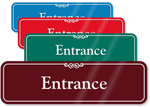
- Entrance Door Sign
- Check In Signs
- Check Out Signs
- In and Out Signs
- Not an Entrance Signs
- Open Closed Door Signs
- Push Pull Door Signs
- Clock Signs
-
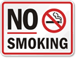
- No Smoking
-
Designer
-
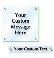
- Designer Signs
- ShowCase Signs
-
-
Signs By Use
-
- Alarmed Door Signs
- Authorized Personnel Only
- Automatic Door Signs
- Do Not Disturb Signs
- Door Knob Tags
- Funny Door Signs
- Keep Door Closed Signs
- Keep Kitchen Clean Signs
- No Alcohol Signs
- No Food Or Drink Signs
- No Guns Signs
- No Pets Allowed Signs
- No Soliciting Door Signs
- Please Ring Bell Signs
- Quiet Please Signs
- Roof Access Signs
- Visitor Signs
-


)
)
)
)
)
)
)